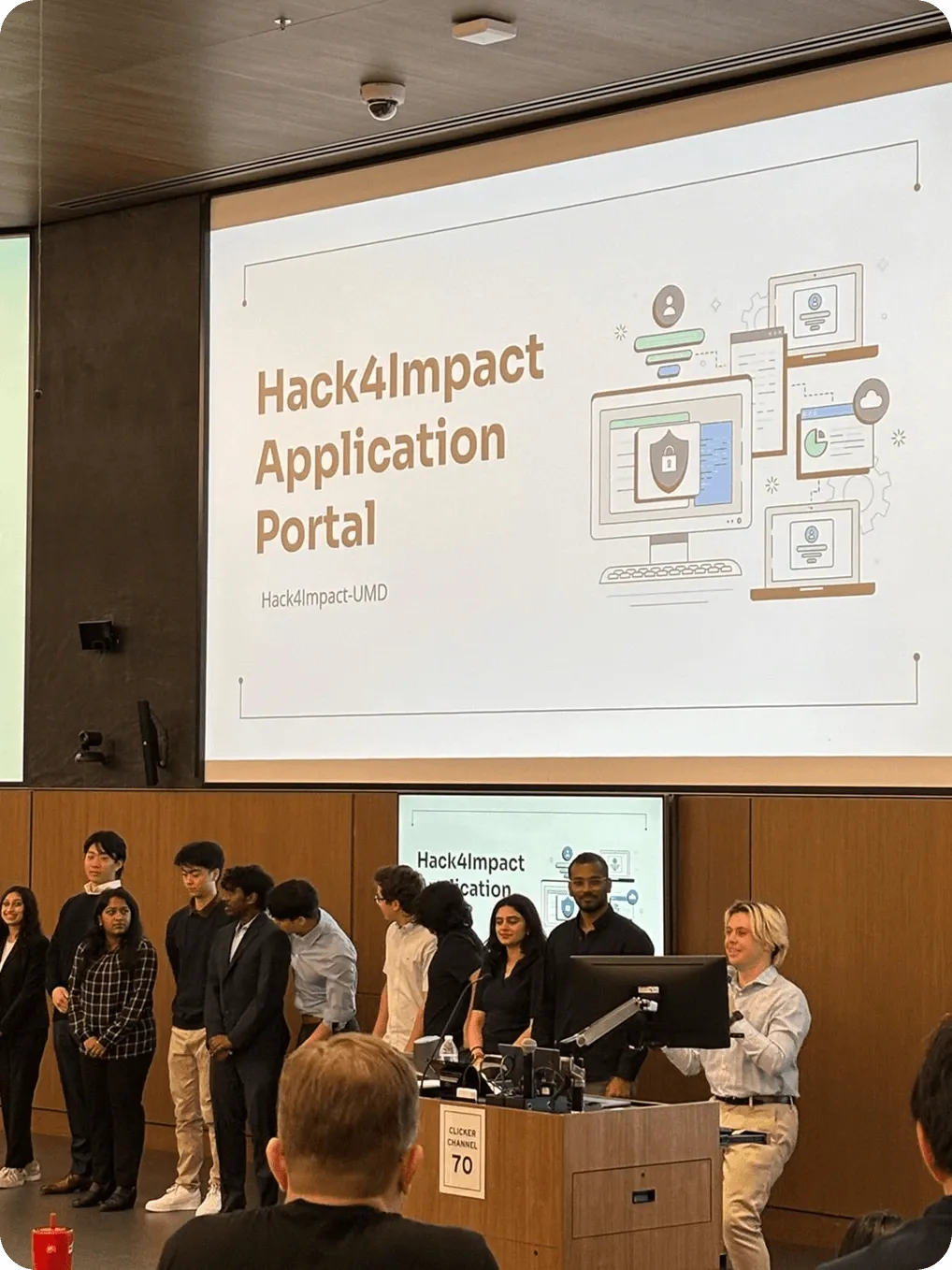
Hack4Impact Recruitment Portal Redesign
Redesigning Hack4Impact’s recruitment portal to streamline applications, centralize data, and create a more transparent experience for applicants and reviewers.
- Role
- Product Designer
- Timeline
- 5 months
- Tools
- Figma
- Slack
- Team of 12
- 2 Designers
- 2 PMs
- 2 Tech Leads
- 6 Engineers
Contributions
Research
- User interviews
- Usability testing
Analysis
- Affinity mapping
Design
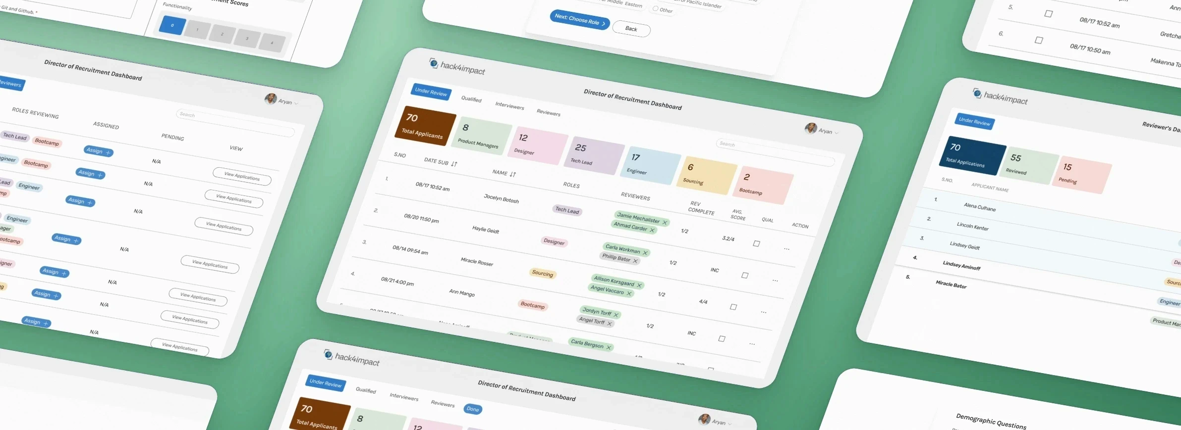
- Admin recruitment dashboard redesign
- Reviewer grading view
- Applicant portal and status pages
Impact
- 94%
- Less time for the admin to get through all applications, from a month to 10 hours
- 40%
- Less time for reviewers to grade applications
- 6 to 2
- Reviewers steps reduced
- 33 to 4
- Applications pages streamlined
- 3 to 1
- Tools consolidated into one platform
01 Context
Who Hack4Impact is, and what they came to us with
- Who they are
- A student-led organization at the University of Maryland that partners with nonprofits to create digital solutions for social good.
- Who uses it
- The Director of Recruitment, the reviewers who grade applications, and the students applying to join.
- What they asked for
- A redesign of Hack4Impact-UMD’s internal recruitment system.
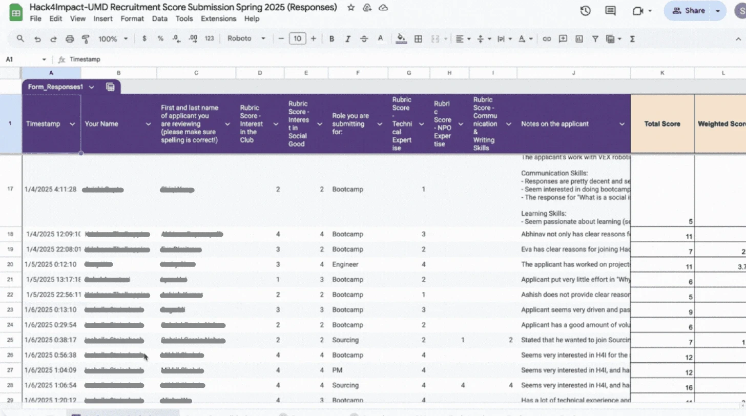
Scattered tools made it hard to track applications
- The 33-page application form often discouraged prospective students from completing it
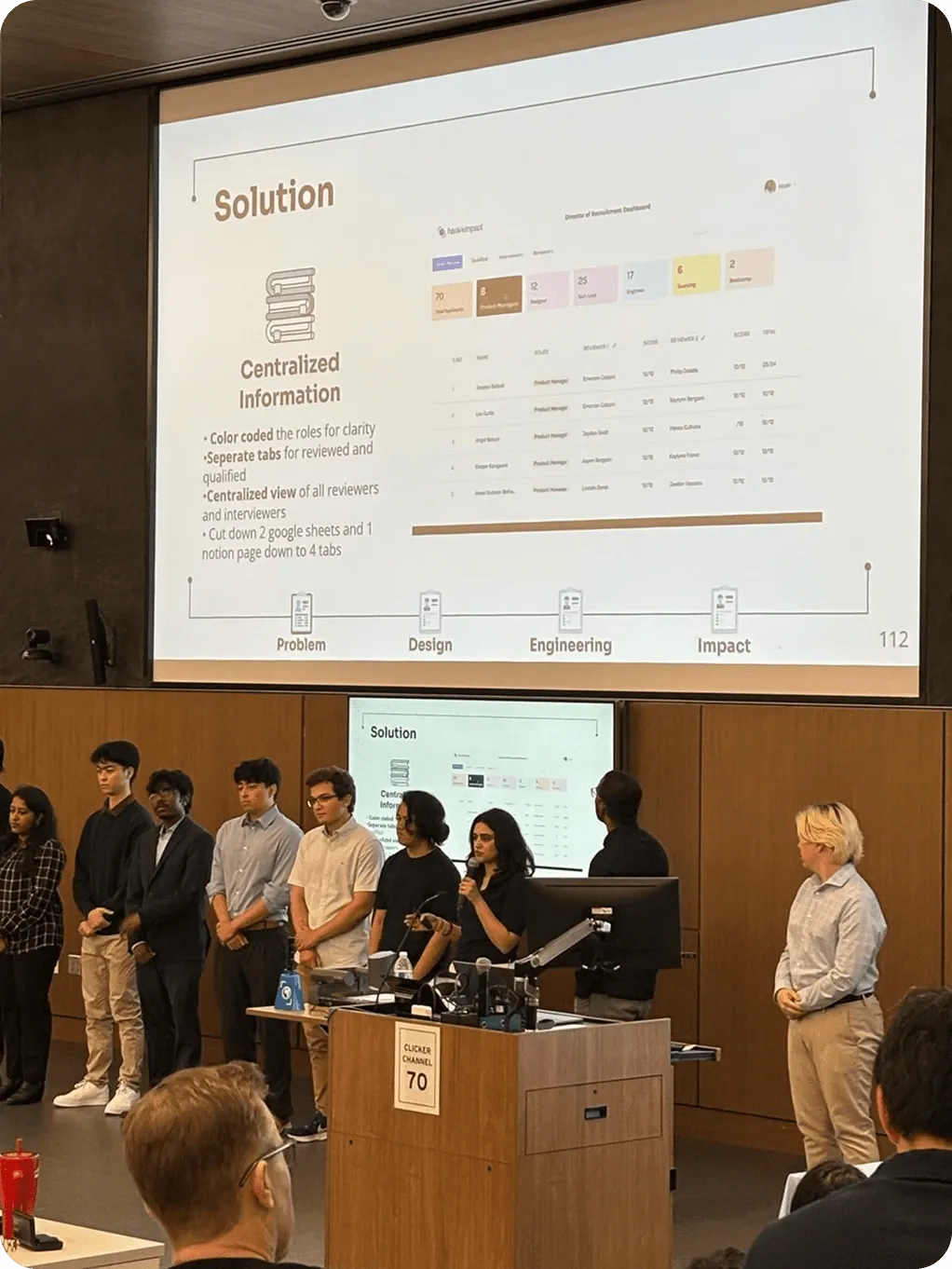
- Reviewers and the Director of Recruitment had to manage applicant data across multiple platforms such as Google Forms, Notion, and Google Sheets.
- Information was scattered, assignments were manual, and reviewing applications required significant effort.
02 Research
What our Stakeholders Think
Director of Recruitment
I interviewed the director of recruitment to understand their current workflow and pain point with their current system. He worked primarily on google sheets.
Unnecessary categories carried over from the Google Form to the google sheets, overcrowding the dashboard
Poor visibility over tracking reviewer progress and identifying new applications
Assigning reviewers and interviewers added a lot of manual workload
There was no way to limit access to reviewers’ to the materials relevant to them.
The director of recruitment needs to repeat the same process for 300+ applications and assign 600 reviewers manually
Current process
- Create spreadsheet
- Add applicant data
- Assign reviewers
- track their process
- Select qualified students
Spreadsheet 1
- create spreadsheet
- Assign interviewers
- Track their progress
- Select qualified applicants
- Send out acceptances
Spreadsheet 2
How might we reduce manual effort for the Director of Recruitment and create a centralized system to track progress of the applicants and the reviewers.
Reviewers
I interviewed 12 reviewers to uncover their pain points and current process. The main pain points I discovered were
It was difficult to track progress between the new and old applications
Search for applications was conducted through shortcuts like Ctrl+F and data entries were prone to errors as spelling errors would make them impossible to find.
To score applications the reviewers workflow was very tedious. Bouncing through google forms, sheets and notion to score.
The reviews toggle through 3 tools for over 500+ applications
Current process
- Find assigned applicant on the google sheet
- Open their application in google forms
- Open the scoring form on notion
- Read the scoring rubric
- Score the application
- Submit the score on gogle sheets
How might we give reviewers a clear, centralized view of applicant information so they can complete evaluations without switching between multiple tools?
Applicants
I interviewed 15 applicants to uncover their pain points and current process. The main pain points I discovered were
Applicants lack visibility when it comes to the status of their submission and are left unsure about their progress.
The 33-page application was difficult to complete in a single sitting, as it is long and tedious.
Applicants had to fill a 33 page form in a single sitting to apply
Current process
- Apply to Hack4Impact
- Start 33 page application
- Open the scoring form on notion
- complete over a few days
- Submit
How might we simplify the application process so that prospective members can complete it with ease, while still giving reviewers the information they need to make informed decisions?
03 Ideation
How can we try to create a centralized view for everyones needs
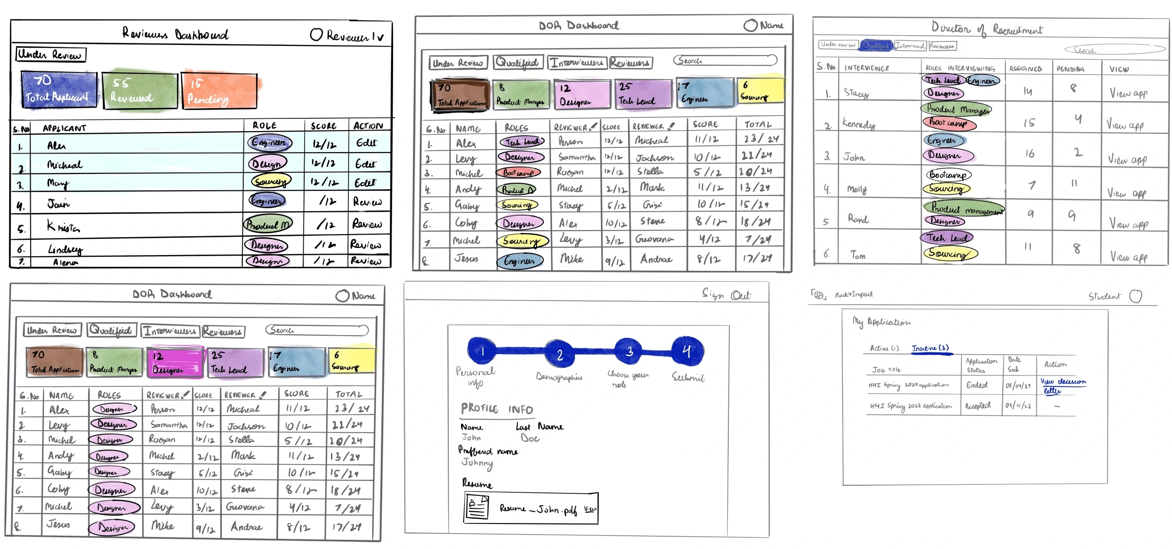
Low Fidelity Sketches
We decided to play with color for quick indicators for each role. SO tracking progress at a glance is easier. We also looked at tabs that are clear and visible to play aorund with.
04 User testing
01 Admin dashboard for the Director of Recruitment
What we tested
- Streamlined navigation: View all applications at once or filter by role, with a color-coded system for quick identification.
- Automated assignments: Reviewers are assigned automatically as applications roll in and participants with the highest scores move into qualified automatically, while still allowing manual adjustments.
- Reviewer management: Track reviewer and interviewer progress, including how many applications each has completed.
- Access control: Introduced a login system with role-based permissions, giving users (reviewers and interviews) access only to what they need.
What broke
Automation took decisions the Director needed to make by hand
- Director of Recruitment preferred manual assignment over automation, as reviewers needed to be matched by skill set. The exception was Bootcamp, where high application volume made automatic assignment effective.
- Automatically moving applicants from “Reviewed” to “Qualified” based on scores did not fit the club’s process. With limited slots and returning members, the Director needed to manually review qualitative data and interview notes before qualification.
Positive Feedback
- Sorting applications by role improved clarity.
- Being able to track the progress of both applicants and reviewers was highly valued.
Director of Recruitment
Our org went through a leadership transition. A new Director of Recruitment (DOR) stepped into the role just as the platform launched. This shift significantly shaped the feedback we received.
What shipped
Manual control over assignments and qualification, with progress visible at a glance
- Manual Assignment: Reintroduced and made the manual reviewer assignment feature more accessible and obvious for greater flexibility.
- Visual Progress Tracking: Color-coded reviewer names (green = completed, grey = pending) to make progress easier to track at a glance.
- Manual Advancement: Added checkboxes so the DOR can move applicants from Reviewed to Qualified based on their own assessment, instead of relying only on automated grading.
- Interview Coordination: Introduced an email icon to quickly copy a reviewer or applicant’s email, making it easier to send calendar invites, interview details, or status updates.
- Holistic Applicant View: (Added the dates) Allowed the DOR to see an applicant’s full history, including how many roles they applied for, to better inform decision-making.
02 Access-only dashboards for reviewers
What we tested
- Side-by-side grading: Reviewers can now view applications alongside the rubric and submit scores without switching between tabs.
- Progress tracking: A clear view of new vs. pending applications makes it easy to track review progress.
What broke
Once a score was submitted, reviewers couldn't see it again
Once an application has been submitted you cna not view the result, and that would be a good edition.
Positive Feedback
Otherwise it has made the process of reviewing very easy and takes much less time. It has increased find-ability of the application and is intuitive to use.
What shipped
A View button to revisit graded applications, read-only to follow the club's rules
Viewing: We added a View button so reviewers can see the applications they’ve already graded. They will not be able to go back and edit any of their actions, as edits are not permitted per the organization’s guidelines.
03 Application portal for applicants
What shipped
A 33-page form became 4 short steps, with live status updates
- Streamlined form: Reduced the original 33-page Google Form into a 4-step application with drop-downs and horizontal pills to shorten scrolling.
- Clear progress feedback: Added a progress bar to help applicants understand how much they’ve completed.
- Application transparency: Introduced status pages with live updates so applicants can track their progress and even view past application outcomes.
Feedback
- Applicants noted that the new form was much shorter and easier to complete compared to the previous year.
- They appreciated that it significantly reduced the overall time required to fill out, while still encouraging deeper reflection.
- Any additional time spent was attributed to the thought-provoking nature of the questions, rather than the form’s structure or design.
05 Design system

06 Learnings
What I Learned
Collaboration with Developers
Working closely with developers provided valuable insight into the feasibility and effort required for certain features. It offered a clearer perspective on how design decisions translate into technical implementation.
Building on Existing Systems
Since the team had to build on an existing system that spanned multiple platforms including one earlier attempt at designing this dashboard, reviewing all prior material was essential. Weekly sprint planning and regular meetings with tech leads, project managers, and stakeholders helped define scope and ensure alignment. This iterative model made it possible to design a product that solved the core problem.
Challenges with Testing
Due to the tight timeline and scope, formal user testing was limited. Instead, the team worked closely with the Director of Recruitment (DOR), gathering feedback on dashboard layouts, data fields, and usability. This became especially critical when the key stakeholder role changed mid-project, requiring the system to be quickly adapted to new needs an interesting and valuable design challenge.
Communication & Teamwork
Strong communication was the backbone of the project. Early and frequent communication kept the team aligned and effective, enabling them to deliver a platform that was successfully deployed and is actively in use. The experience underscored the importance of collaboration, adaptability, and shared ownership in creating meaningful solutions.
07 Team
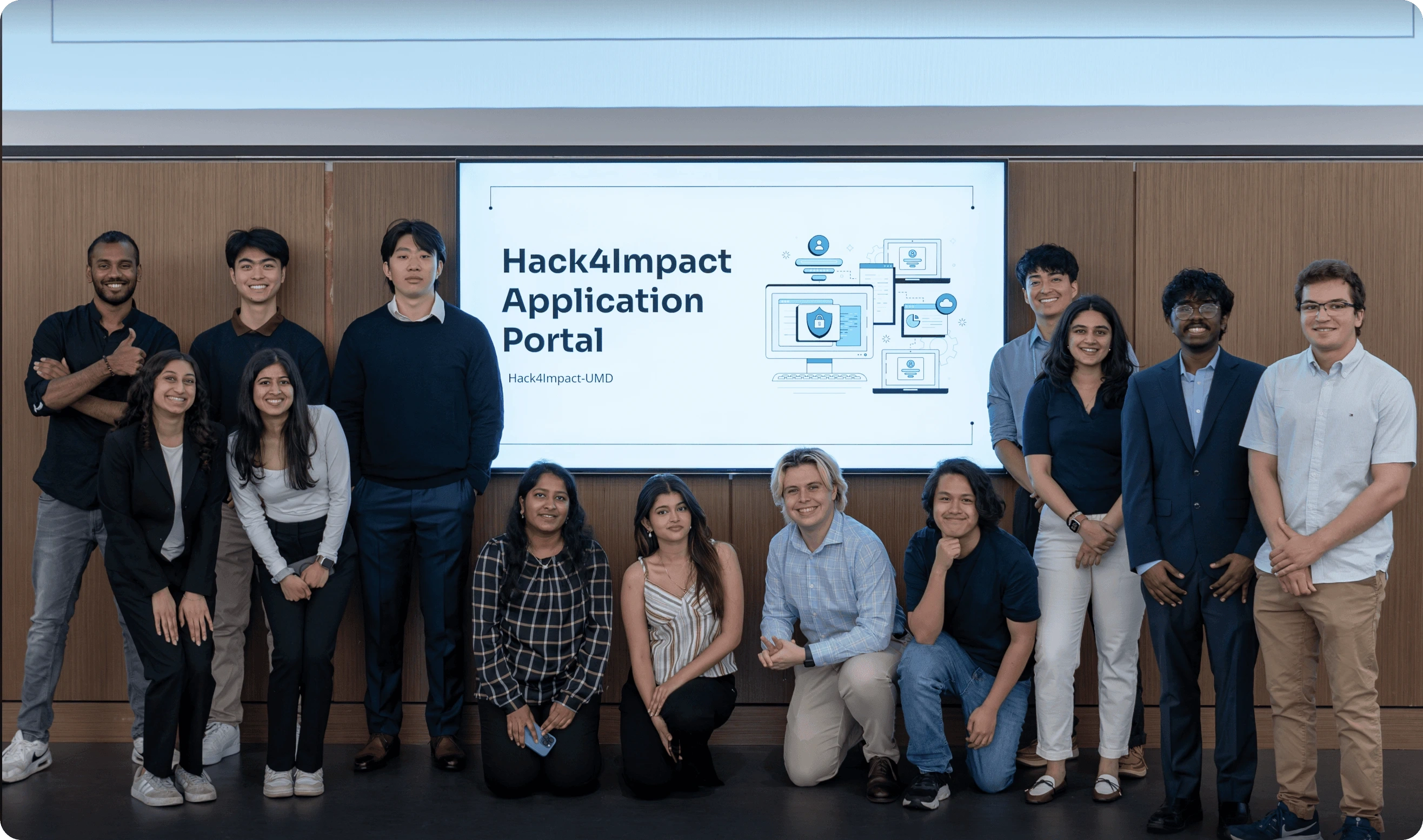
My Amazing Team